Vertical Logic
With respect to overall structure, a good deck will usually exhibit two different kinds of logic:
- Horizontal Logic, which refers to the overall coherence of the story from one slide to another. Do action titles, when read in sequence, tell a clear and logically-articulated story?
- Vertical Logic, which refers to the internal coherence of a given slide. Is the action title supported by the body slide? Does the evidence presented support the overall message?
I am using a deck I helped put together a few years ago, for illustration. The content is long out of date, but it’s a decent example that I happened to have on hand.
Unlike horizontal logic, which deals with a story line across multiple slides, vertical logic is a feature of each individual slide.
To assess vertical logic, one looks at whether the action title (or the slide’s key message) is supported by the evidence below.
The “vertical” aspect here refers to the stacking of the action title (usually on top) and the slide body which supports the title. Does the stuff “below” support the message “above”?
A Simple Example
Here’s an example of a slide with a simple, straightforward message.
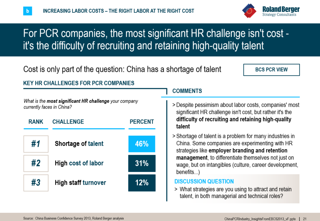
Let’s break the structure of the action title down:
- The most significant HR challenge isn’t cost, it’s the difficulty of recruiting and retaining high-quality talent
The logical structure of the message is very simple. We are simply claiming that one thing is more significant than the other.
In a slide displaying good vertical logic, the body of the slide should fully support the message. In the example above, this is achieved in one straightforward:
- By sorting the elements implied by the action title in decreasing order or importance, and by highlighting the most important item, we provide a visual cue establishing that – indeed – one of these things is most significant
Note that because this particular deck was prepared to support a “round table” discussion, we had a few extra comments on the side as well as a “discussion question” to help move things along. We could remove the comments section entirely, however, and the vertical logic would remain.
A (Less) Simple Example
Other examples can be more complicated, but the underlying logic is the same.
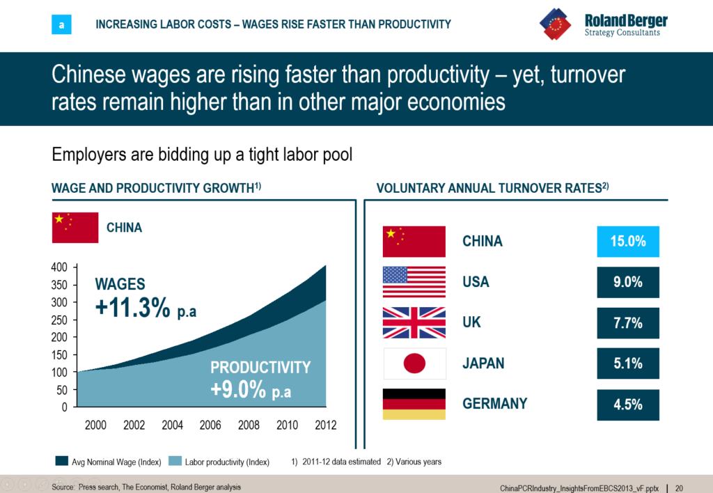
As before, let’s start by breaking down the key message here, and the logical structures involved.
At the highest level, we have the dramatic opposition of two distinct observations: (1) wages are rising faster than productivity, but (2) turnover rates remain high. Within each observation, however, we also have a secondary logical structure (faster than, higher than):
- Chinese wages are rising faster than productivity (a measure of economic output – essentially, employers are having to pay more for each unit of output)
- Turnover rates (or the rate at which employees leave, and must be replaced by their employers) are higher than in other major economies
As in our first example, the body of the slide fully supports all aspects of the message. This is achieved in two ways:
- By dividing the slide into two halves that “point away” from each other. This visual opposition reflects the dramatic tension found in the action title
- By using visual cues to display the relevant data in a way that mirrors the secondary logical structure of the action title:
- Stacking wage and productivity growth in an area chart makes it clear that one series is growing faster than the other, something we can further highlight with some over-sized labels
- Sorting turnover rates in decreasing order while highlighting the figure for China makes it clear that one country’s statistic is much higher than the others
Sometimes, one starts with a message, and must develop a new slide body to fit. Other times, one is re-purposing a slide from somewhere else in support of a slightly different message. The specific situation is not important: at the end of the day, the body of the slide must efficiently support its action title.


